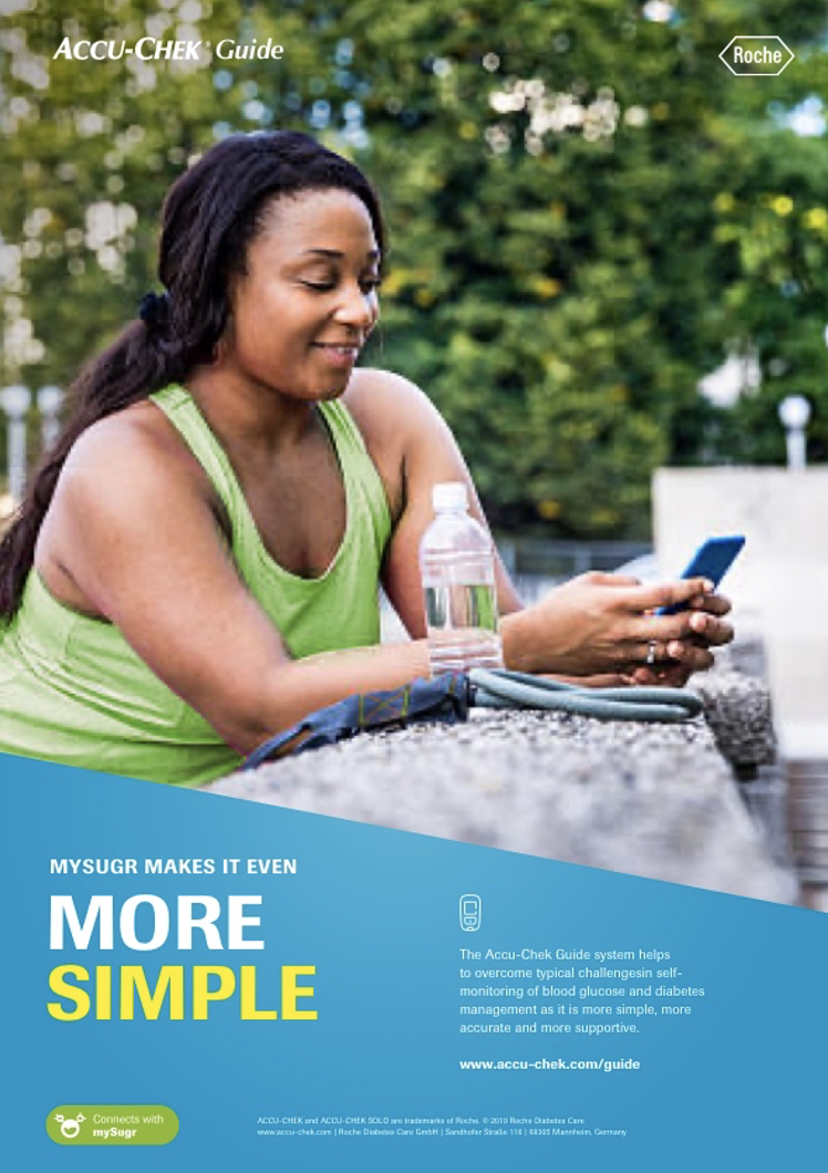
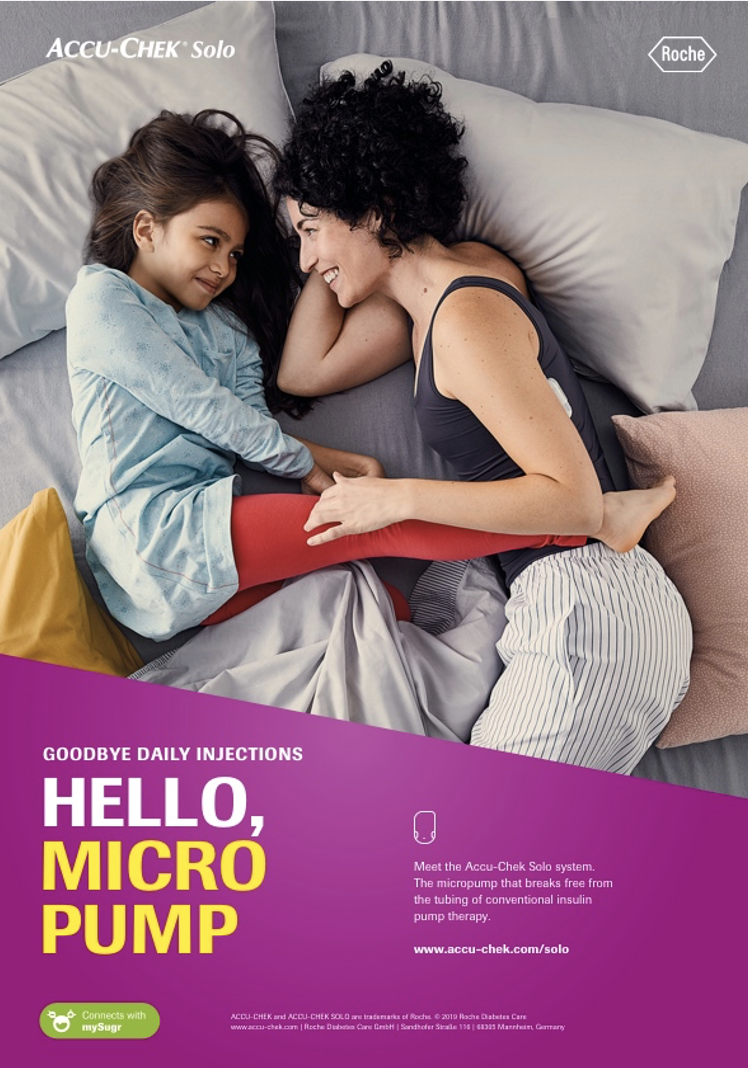
Accu-Chek Brand Refresh
Accu-Chek is a well-known brand, trusted daily by people all over the globe to help them manage their diabetes. When we were developing an update to the branding, we decided to keep that heritage at the heart of it all, using the slant in the “A” of the logo as a basis for our design.
Once we had the Brand Space set, we continued on creating a bold look that was strong, but flexible enough for markets all over the world. We created simple brand guidelines that gave easy instructions for working with product or lifestyle imagery as well as copy guidelines that helped to keep the story clear to a wide audience.